Blair Nangle
Dynamic Gatsby layout with CSS media queries
Goal
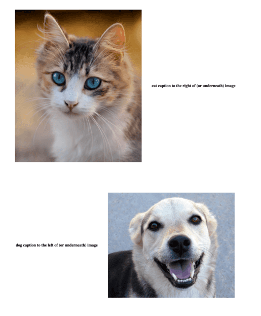
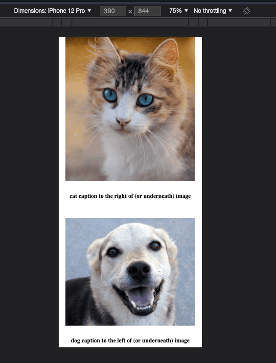
I wanted to conditionally change the relative positions of a list of image-caption pairs based on the user’s device viewport width.
Desired desktop appearance
Desired mobile appearance
Problem
Ordinarily when working with conditional rendering in React, I would just use JavaScript to detect the relevant user-specific state and then have some logic to return a modified or completely different component. However, due to Gatsby’s static server-side rendering mechanism, standard methods for determining a user’s device type in JavaScript were suboptimal for the static site I was building.
Solution
Overview
- Use media queries to check for screen size, with different styles for big and small screens
- Use
orderto have the caption on the left or right of the image (or above or below in the case of small screens) - Reverse the order of the second image-caption pair in the case of small screens so that captions are always underneath images
Method
For simplicity’s sake, we’ll define an array of objects in code that include statically imported images (rather than playing around with a GraphQL query):
import cat from '../images/cat.jpg';
import dog from '../images/dog.jpg';

const IndexPage = () => {
  const captionedImages = [
    {
      src: cat,
      caption: 'cat caption to the right of (or underneath) image',
      captionPosition: 'right',
    },
    {
      src: dog,
      caption: 'dog caption to the left of (or underneath) image',
      captionPosition: 'left',
    },
  ];
}
We can then map over this array to construct our list of captioned images:
return (
  captionedImages.map((ci) => CaptionedImage(ci.src, ci.caption, ci.captionPosition))
);
Where CaptionedImage is defined as:
import React from 'react';
import CaptionedImageStyles from '../styles/CaptionedImageStyles';

function CaptionedImage(src, caption, captionPosition) {
  return (captionPosition.toLowerCase() === 'right'
    ? (
      <CaptionedImageStyles>
        <div className="captioned-image-container">
          <div className="captioned-image">
            <img className="image image1" src={src} alt={caption} />
            <h4 className="caption caption1">{caption}</h4>
          </div>
        </div>
      </CaptionedImageStyles>
    ) : (
      <CaptionedImageStyles>
        <div className="captioned-image-container">
          <div className="captioned-image">
            <h4 className="caption caption2">{caption}</h4>
            <img className="image image2" src={src} alt={caption} />
          </div>
        </div>
      </CaptionedImageStyles>
    )
  );
}

export default CaptionedImage;
This component definition makes sense when thinking about the relative left/right image/caption positioning (assuming a row-based flexbox), but won’t work for above/below positioning (without some CSS trickery).
This is where CaptionedImageStyles comes in:
import styled from 'styled-components';

const CaptionedImageStyles = styled.header`
  .captioned-image-container {
    @media (min-width: 768px) {
      .captioned-image {
        align-items: center;
        display: flex;
        flex-direction: row;
        padding: 60px;
        justify-content: center;
      }
      .image {
        padding-left: 20px;
        padding-right: 20px;
        max-width: 500px
      }
      .image.image1 {
        order: 1
      }
      .image.image2 {
        order: 2
      }
      .caption {
        padding-left: 20px;
        padding-right: 20px;
      }
      .caption.caption1 {
        order: 2
      }
      .caption.caption2 {
        order: 1
      }
    }
    @media (max-width: 767px) {
      .captioned-image {
        align-items: center;
        display: flex;
        flex-direction: column;
        padding: 10px;
        justify-content: center;
      }
      .image {
        max-width: 100%;
        height: auto;
      }
      .image.image1 {
        order: 1;
      }
      .image.image2 {
        order: 1;
      }
      .caption {
        padding: 10px;
      }
      .caption.caption1 {
        order: 2;
      }
      .caption.caption2 {
        order: 2;
      }
    }
  }
`;
@media (max-width: 767px) is standard CSS media query logical operator syntax for applying styling to devices with viewports below a certain width (767 should cover all phones and most tablets—of course, this same method can be applied to more granular
viewport widths and layouts). The clever parts are changing the flex-direction for mobile compared to desktop and using order to override the relative positions of div and img elements within the captioned-image CSS class. Notice the different
values for order for smaller screen sizes—we always want the caption to come after the image, regardless of the order of elements within the div.
The slightly unusual CSS syntax (e.g., .image.image1) is making use of CSS inheritance to reduce code duplication.
Notes
Gatsby’s static server-side rendering
Unless configured to use server-side rendering or delayed static site generation (which are both more appropriate for large/media-heavy sites and only available since Gatsby v4), Gatsby generates the entire HTML for the site at build-time. Note that the Gatsby project uses the term “server-side rendering” (SSR) to refer to dynamic sever-side rendering—i.e., HTML that is only created on request from the client. New Gatsby 4 features aside, Gatsby creates the HTML for all pages at build/compile-time—this method is referred to in the wider web dev space as SSR.
Generating the necessary HTML at compile-time makes page loading extremely fast but also means that, if JavaScript is used to generate some elements at runtime based on user state (e.g., browser viewport width), a second-pass render will need to occur. This can manifest as a flash or the wrong content/layout being shown initially for the user.
Josh Comeau sums it up well in this blog post:
When working in Gatsby/Next apps, I’ve found it really helpful to think in terms of a two-pass render. The first pass happens at compile-time, wayyy ahead of time, and sets the foundation for the page, filling in everything that is universal for all users. Then, much later, a second-pass render will fill in the stateful bits that vary from person to person.
For situations where an additional render is required, Josh has an elegant solution. And Ferran Buireu has a nice workaround, specifically for navigation bars.
CSS inheritance
It is possible to combine properties from child and parent CSS classes to style an element:
<img className="image image1" src={src} alt={caption} />Using the CSS definitions above, this img element would end up with a union of image and image1 styles—i.e.,
`
padding-left: 20px;
padding-right: 20px;
max-width: 500px;
order: 1;
`
